What fantasy readers look for
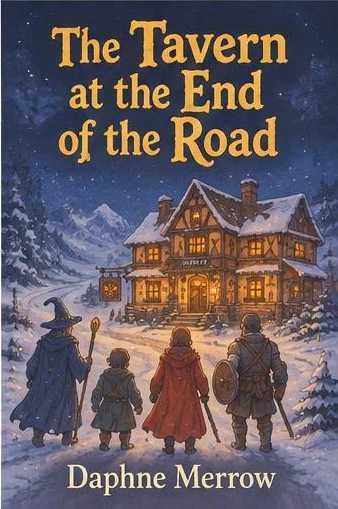
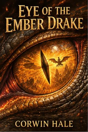
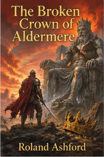
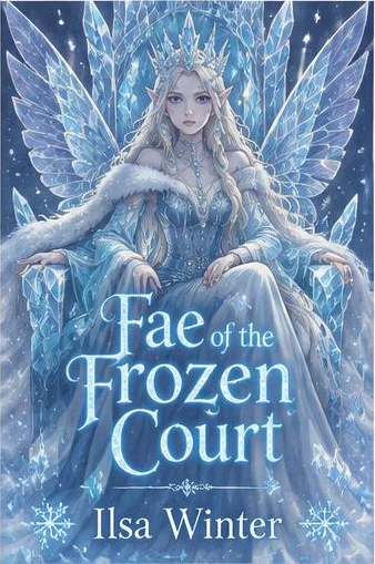
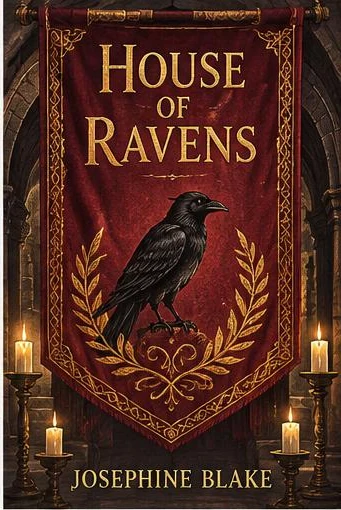
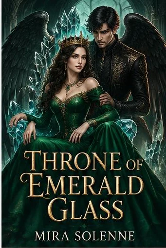
Fantasy covers are explicit: the art and the title together should name the subgenre without a word of blurb. A lone warrior on a cliff says epic; a woman with a crown and a dagger, framed in gold filigree, says romantasy; a cottage, a cat and warm lamplight say cozy.
Readers also expect craft. Painterly art, ornate frames, foil-effect titles — fantasy is the genre where an obviously cheap cover hurts the most, because the shelf around it is so polished.
Composition, color and type
- One clear focal point: a figure, a creature, a sword or a symbol — a crowded scene turns into noise at thumbnail size.
- Palette by tone: deep blues and gold for classic magic, black and red for dark fantasy, greens and warm ambers for cozy.
- Symbol covers are rising: a sword, a crown, a moth or a key inside an ornate frame, especially in romantasy.
- The title big and legible: decorative serifs and foil effects work, but they still have to read on a phone.
Common mistakes
Clashing signals are the most frequent problem: a cartoonish dragon on a grim war epic, a dark gothic cover on a lighthearted cozy story. The second is a scene so detailed that nothing stands out. The third is a title in a typeface so ornate that readers cannot tell what the book is called.
Questions and answers
How much does a fantasy cover cost?
Your first generation is free: you pick one of nine options and see its cover as a preview. Full resolution is $1.49 per generation, or $7.90 for a pack of ten.
Will the title be spelled correctly?
Yes. The title and author name go to the model letter by letter, and the typeface is chosen to fit the genre. Each generation gives you nine options in different styles to choose from.
Can I make a cover in the style of one of the examples?
Yes. Every example has a “Make one like this” button: the generator opens with that genre and uses the example as a style reference, and you enter your own title and author.