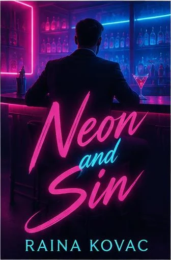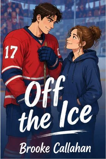




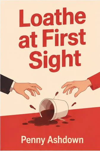



How the trope reads on a cover
- The standoff: two figures face to face, too close, neither giving ground — the most direct signal.
- Back to back: arms crossed, looking away from each other, a classic for rom-coms and workplace rivals.
- The near-touch: hands almost meeting, a grip on a wrist, a tie pulled tight — tension that is about to turn.
- A split palette: cold blue on one side, hot red on the other, or two halves of the cover that do not quite match.
Whatever the composition, the two leads should feel opposed. A couple calmly holding hands reads as a different trope entirely.